Home Painting Guide
Home Painting Guide – Coordinate Your Colors
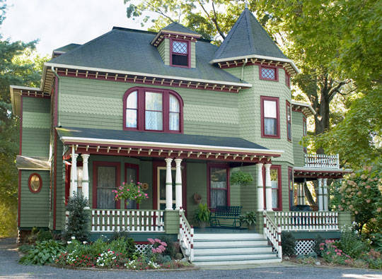
 When house painting, there is more to just thinking about your favorite colors. You need to make sure your colors coordinate with each other. This will help to create a flow in your home, while making it look great for you and your guests. Here are some tips for coordinating your colors whenever interior or exterior painting.
First Think of Your Color Scheme
Before you pick your paint for your interior painting, consider your color scheme. Think about everything in the room, including your furniture, carpet and blinds. There may be aspects you don’t want to or can’t change right now, so think about colors that will work with them. Working with the colors will help to create a more pleasing look afterwards.

Limit Multiple Color Choices
You may want to opt for a couple of color choices, whether to make certain aspects of a room stand out or to make one wall the main focus. This also works with exterior painting, if you want to make a specific area of your home stand out to passers-by. However, limit the multiple colors you choose. Opt for two or three at the most that all work together. The same color in different shades can work extremely well for your house painting.
Repeat Colors Evenly
When you are using multiple colors, make sure you use them evenly. This doesn’t have to be just through paint. You can use them with fabrics and furniture throughout the rooms. Using one color at least three times will avoid it looking odd. Use the lighter colors more  frequently to keep your space looking larger.
Why Coordinate Colors?
Whether you’re working on one room or thinking about exterior painting, it’s important to coordinate your colors. This helps to improve the flow of your home, while making it look brighter and more spacious.
Color Ideas – House Painting
Colors, colors, and more colors, but how do you choose which one is right for you? With the help of our experts and tips we’ll get you started on the right path.
Why do we find one place interesting and are uneasy in another? Why are we fascinated by one product over another? Color—whether architectural or in products—accounts for 60 percent of our reaction to an object or a place.
This years best color ideas! Now you can easily make professional choices.
Click here and better visualize the colors for your home
The effects of color are subtle and significant; physical and psychological. Wherever we go we respond to color, but the importance of color is often underestimated. Color use is important to us personally in our homes and in the places where we work.
Start small with simple color choices
If you’re not sure where to begin with color, experiment in a powder room or bathroom, a small hall or area between rooms, or an accent wall. If you’re doing your own painting, pick an area that’s quick to do so you can see your results sooner, and be happy with it or change it. Look at the process as a positive experiment.
To get started you can choose from your favorite piece of furniture, dish set, artwork, or accessory as a main color or accent.
How to put your best color ideas into action
Repairs & Paints is ready to help you on your way to a better looking home. Call us to get expert style options for your home painting project.
Some of the best tips out there!
When creating a warm or cool color scheme, choose one color as the predominant color and then other colors as accent colors. If you have a long and narrow room, you can consider painting the end walls a darker shade than the long, narrow walls. The darker colors will recede and will create an illusion of width in this instance. Light colors will advance. Solids and simple patterns reduce visual weight, while bold patterns add visual weight. Bright and intense colors add visual weight, while muted, neutral colors reduce visual weight. To make a small room look larger, choose a light-color paint and select furnishings in the same color family. Or, you can paint some of the furniture to match the walls. Light-color ceilings will attract attention, but dark-color ceilings will direct the eye back to head level, allowing the focus to be on the walls, furnishings and accessories in a room. Light affects color dramatically. Fluorescent light tends to be cool lighting and brings out more green or blue in a color. Incandescent light — light bulbs — brings more of the red or warmth out in a color. It is important to view colors in daylight or night, because they will appear different. The location of color within an interior space can make a great deal of difference in influencing the room’s character. A color placed on a ceiling, wall or door may elicit many different reactions. Perception of temperature may also be altered with color. Most design schemes contain more than one color in a space, so if the design includes a color from each group — warm and cool — coordination of the space is still accomplished.